The Roman born designer Alessandra Branca is known for her red and black and gold interiors. She uses classic fabrics and traditional furniture mixed with antiques, many in the chinoiserie style. She always mixes in a surprise, a contemporary piece or an unexpected accent to keep her interiors exciting. Her new line of fabrics for F. Schumacher are so classic that many of her rooms using these designs are a throwback to the more lively interiors of prior decades.In fact, on her instagram, Alessandra proclaimed - “I believe the 80's are BACK !!!! What is old is new again!”It’s as if her new fabrics have taken her back to a more colorful era with patterns and layers and chintz.Look:In this year’s Kips Bay Showhouse – Alessandra used her fabrics mixed with Pierre Frey’s Braquenié curtains. Could a room be any more traditional? The contemporary art work and light fixture give it that exciting pop that Branca favors.
She used yardage of Pierre Frey’s Tree of Life fabric laid casually over the couch and on a settee. Her own chinoiserie screen from her NY apartment was borrowed for this room.
In this Elle Décor apartment, Branca used her new Schumacher fabric on the walls and curtains. Beyond fabulous. Alessandra at her best.
And in this Illinois showhouse earlier this year, Branca used her Schumacher chintz fabric against dark walls.
Another view of the living room. I think this room is so classic, so traditional, it’s just perfect in my opinion.
So, while Alessandra is designing very, very classic interiors for showhouses and for herself – the new September issue of Veranda with a Branca designed house was a surprise.
I recognized the house, it had been featured in House Beautiful back in 2009 – I even showed it on the blog all those years ago. Apparently, the young couple who own the 19th century, 4 story Chicago townhouse, had hired Alessandra to renovate and decorate their house the first time. Ten years later, they wanted her to update it. So soon?
I think ten years is the time period that trends and design styles tend to look dated. And it’s the time period that SOME people start to get restless with their interiors and want them updated.
Alessandra Branca is one of my favorite designers and without a doubt, a first class one at that. Studying her interiors is akin to taking a course in design – there is much to learn from her - and her book and pictorials give one that opportunity.
And so, I couldn’t help but project my thoughts onto Veranda’s story, looking at the choices Branca made as she explores a more contemporary, more youthful aesthetic.
It is interesting to look at the house – before and after – to see what stayed and what was changed. I thought the house was perfect to begin with, so, the question is:
When you already have a perfect house – do you need to update it just because it’s been 10 years?
For instance, this living room was designed by Branca several decades ago and I’m not sure I would change a thing today. Does it really need a Sputnik light to be on trend?
WHY WOULD YOU UPDATE AN ALREADY PERFECT INTERIOR?
BEFORE: The townhouse was first seen in House Beautiful, 2009. When it was first bought, it needed updating and decorating. The division between the entry hall and the living room had been removed, so Branca placed a large screen that acted as a wall – with art on both sides. Here – is the entry hall – with a suzani covered bench and antique chest. The couple waited three years for Branca to find the perfect mirror.
A somewhat bigger photo scan from the House Beautiful pictorial.
BEFORE: Unfortunately, there aren’t large pictures of the front living room – but here you can see Branca’s trademark European stringing yellow silk curtains with blue velvet trim. Behind the sofa is the screen. Antique Swedish chairs have red damask fabric.
You can see the beautiful red lamp and skirted table in the corner. On the walls is a faintly patterned yellow paper. A textured rug is underfoot – all items that Branca likes to use.
AFTER: And here is the living room today. It is totally different – with lilacs and pinks instead of yellows and red. The new color scheme was inspired by the Damien Hirst print with lilac Fortuny on the chairs. The Italian stringing panels are replaced with a more contemporary styled curtain. Branca removed the yellow print wallpaper and added faux stone walls created out of parchment wallpaper. The textured rug was replaced with a soft wool one.
Branca updated the antique lamps by placing a glass sleeve over them along with new trendy shades. The difference is remarkable – for several reasons.
First, the new color scheme is different from the rest of the house, which didn’t change in the renovation. To me, it doesn’t seem to flow with the rest of the house. Branca says of this new color scheme: "You never want a house to look like Garanimals. There's really nothing worse than matchy-matchy."
But I do like “whole house decorating” and think a cohesive decorative scheme makes sense.
Second, is this a color scheme that will last as long as reds and golds and blues?
BEFORE: At the original renovation, Branca coved the ceilings with new molding, and here in the dining room, painted it a darker color for contrast. French chairs surround an antique table along with a red and blue Bennison covered banquette. Red check fabric at the windows keep the room casual while a trio of 1950s Venetian de Majo light fixtures are an interesting contemporary surprise. Grasscloth covers the walls and add more casual texture. Throughout the house, Branca added French doors at room openings to let light flow through the townhouse.
Another photo from the 2009 photoshoot. As you can see, the dining room doesn’t flow with the newly decorated living room with its lilacs and pinks – so this is the next room Branca tackled.
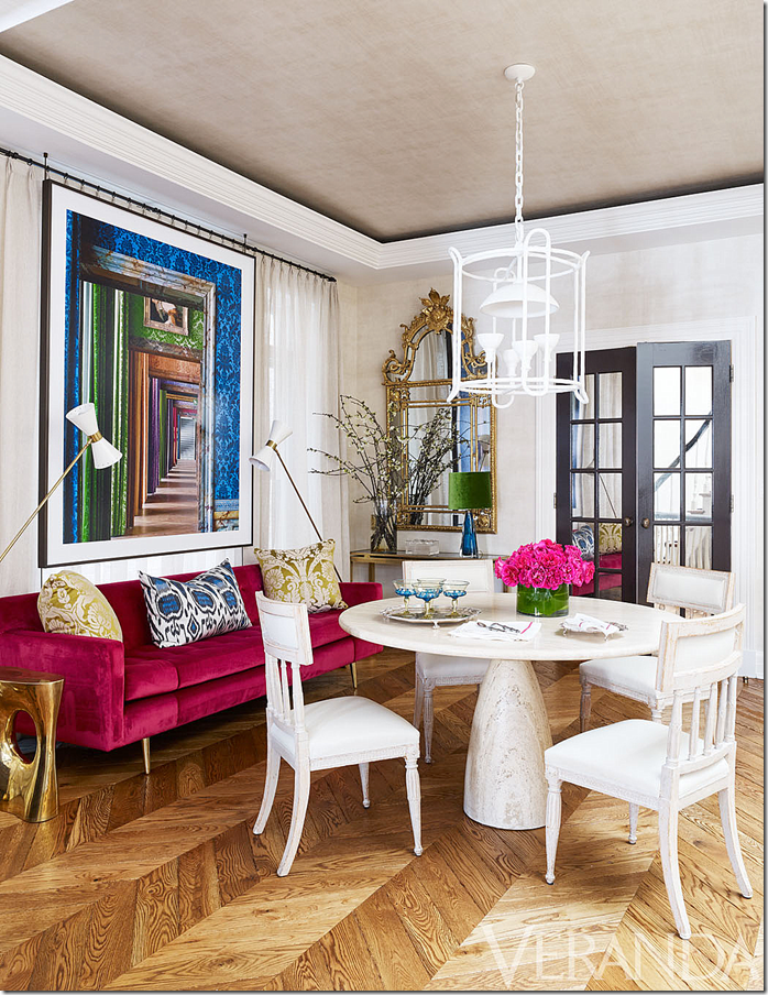
AFTER: The newly decorated dining room is as much a change as the front living room. Here, you can see the new wood floors in a chevron pattern that Branca replaced from the plain wood planks that were there before. Antique Gustavian chairs are covered in white leather and mixed with a hot pink velvet Edward Wormley sofa. A contemporary Plaster of Paris Stephen Antonson light fixture replaces the three previous ones that no longer worked over the round table – though I loved them! Against the back window wall, Branca placed a large vibrant print that floats in front of the curtains. The gilt mirror that was in the foyer is now placed here and the white French door is now painted black.
BEFORE: The family room was done in a soft aqua blue. Very traditional, very Alessandra Branca. Above the fireplace is the flatscreen, and flanking it are two antique metal cabinets which Branca replaced screen in their front panels. Above is a French styled lantern and below is a blue and cream textured rug.
And a view of the two antique leather wing chairs in front of the large window.
Looking the other direction – the French doors replaced a plain one. Note the table between the chairs with the velvet base.
AFTER: Today, Branca mostly just tweaked the room, updating things but keeping the basic scheme intact. First, a vintage, white coffee table replaces the beautiful velvet ottoman. And a new rug is placed. Most notable is the lantern has been replaced by a white opaline glass and brass fixture from the 50s. The TV is replaced by art work that once hung in the landing. The walls are covered in a more creamy, textured paper and the blue and white porcelains are replaced with white.
The changes are subtle but when you look at the new and old designs, the new design is
much more sophisticated and more of the times.
This side of the room is almost the same, but a brass table between the antique leather chairs brings in another touch of contemporary, as does the round mirror over the painted chest. Here you can see the beautiful new floors.
Close up of the blue striped linen curtains.
AFTER: There are no before pictures of the kitchen, but today it is a showcase of contemporary and classic – along with the newly placed vintage light fixture. You can see that Branca used new fixtures throughout the house to update its décor. In the kitchen Branca carefully matched the stain of the cabinets to the floors to present a cohesive, thought out design – a benefit to hiring a talented interior designer.
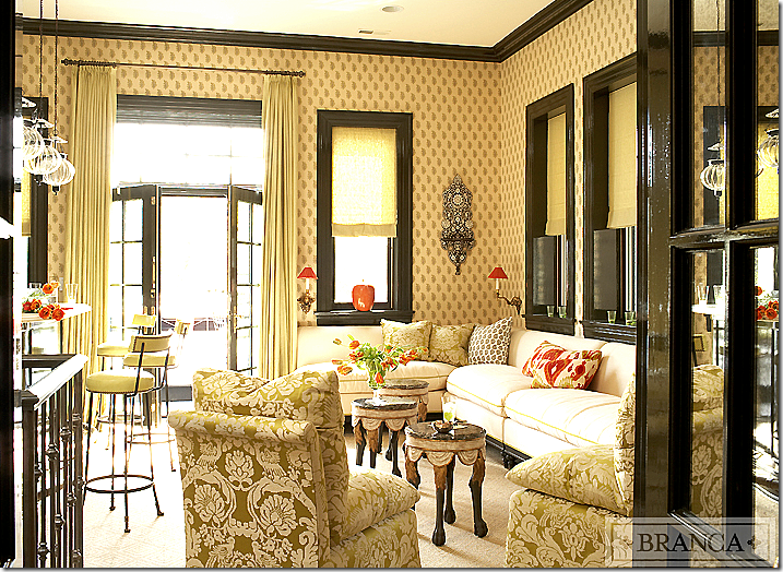
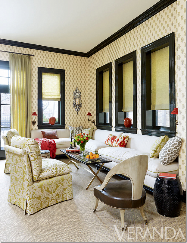
BEFORE: My favorite room, the bar, received few changes. Except for a few small changes3, this room remained the same – with the décor that matched the original red, yellow and blue décor scheme – as opposed to matching the newly redecorated living room and dining room.
BEFORE: The fabulous vintage looking bar with its charming stools and trio of glass pendant lights.
TODAY: A more contemporary coffee table replaces the three antique ones and a spoon chair was brought it. Otherwise the bar was left the same, with the original color scheme.
BEFORE: The Moroccan inspired guest room is another room that wasn’t changed and remains in the old color scheme – the yellows and reds and blues rather than the lilac and pinks.
BEFORE: The sitting area in front of the fireplace.
AFTER: The only change I think is the addition of the throw on the bed and the addition of one of the bar’s little tables. Why mess with perfection, I say? But, is the old color scheme mixed with the new scheme too jarring?
A vignette against the golden walls.
BEFORE: The master bedroom foyer with its black lacquered walls and floors.
AFTER: In Veranda, the same area with just a few tablescape changes.
BEFORE: The master bedroom with its gray walls and dark floors is quite different from the rest of the house’s first décor and seems more in tune with the new color scheme. Fortuny curtains sit within a bay area that is wallpapered in matching fabric. The zebra provides the main pattern.
BEFORE: I love the matching brass floor lamps with the Fortuny shades.
Alessandra instagrammed this photo of the room.
AFTER: Today, the desk chair is changed from its paisley to white fabric and a stool sits in front of the bed now. The biggest change is the bed! Wow! The brass legs! From the Branca Collection. The bedroom seems very in tune with the newly decorated areas – the living room and dining room.
AFTER: The powder room. Beautiful sink and faucet.
BEFORE: In the basement, the hall is lined with a striped runner and chalkboard covered walls. The scheme is the former red and yellow. No idea if this was updated.
BEFORE: The playroom in the basement is a mix of colors and stripes and prints.
BEFORE: The media room in the basement is pure Alessandra Branca with red lacquered walls and a mix of paisleys, suzanis, and stripes.
So – what do you think about updating your interiors, leaving some rooms with the former color scheme but not all? Should you update your interior just because it’s not trendy? Alessandra says she is against whole house decorating when she said: "You never want a house to look like Garanimals. There's really nothing worse than matchy-matchy.”
But is there?
Does the new living room look as good with the bar as it did before it was updated? Or does it not matter?
I think I vote for matchy-matchy.
What about you?
Read this story in the September-October issue of Veranda!!
And – do not forget to visit Tara Shaw’s web site – where she is extending a 30% discount on purchases of $200 and more to all Cote de Texas readers! Use the code COTE30TEXAS when checking out HERE!


0 comments:
Post a Comment