One quick comment, after many years – you may notice I have a new blog design! Whitney English designed it for me and I think it really expresses my aesthetic. There are still a few tweaks to be worked out, so excuse me until I get it all finished!
This week I went on Zinio and looked at several months worth of design magazines, screencapping all the photographs I really liked. By reading so many magazines at one sitting, two trends really stood out.
And at the same time, an old design adage proved more true than ever. Basically – that classic design is always a good thing. Trendy decorating is tricky and should be left to only the best and even then… it’s still tricky.
If an interior is classic – it will get better with age and will be in style for ages. For example:
Michael Taylor’s 1960s design – 55 years of looking great.
Rose Tarlow’s London apartment circa 1989 was designed using classic elements that still look great today. If you choose antique and traditional furniture and accessories, the interior will continue to look great through the years.
While a classic design is timeless, the trendy ones come on strong and then tend to die out fast. Of the two trends I noticed this week – one I loved and one left me crazy.
Most striking is how drastically lighting fixtures have changed in the past few years. For many years – we all made classic lighting choices – crystal chandeliers and lanterns and Italian candlestick styled fixtures to name a few:
Classic crystal chandeliers. You can never go wrong with one.
This fixture is so pretty and it will always look good.
From John Saladino’s dining room.
I love this quote from Saladino:
“I think a lot of modern chandeliers are hideous. They look like Sputniks and throw light on your head and not on the table, where you need it.”
He said it – hideous. I love this man!!!!!
We all used these - antique styled French lanterns. How bad can a design be when it’s a few centuries old?
And then, it all changed. Overnight.
50s styled Sputnik chandeliers invaded the states like the Russians were in South Florida. I mean…what????
OK --- I like a good sputnik. I do.
This looks good. It makes sense. I like the crystal Sputniks. Of course. Crystal.
And this is nice – truly. I get it. And I like it.
I actually love this one – from Restoration Hardware. It’s a great look. And it makes sense here.
But then, what is this – and on the cover? It’s vintage 50s. Honestly, it looks like bowling pins. Restoration Hardware has a copy of this in dark bronze. I don’t get this. I think it’s awful.
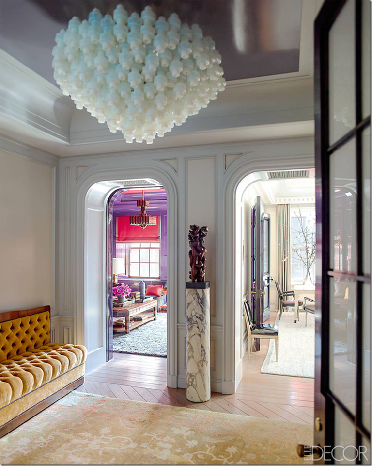
Lord. Is this pretty? A pyramid of upside down Q-Tips. In Elle Décor. I think Saladino would call this one hideous.
Is it me??? It looks like a white beehive. This trend just went on and on, page after page.
If one is good, then two must be better – especially when one is too big to begin with . The scale is so off here.
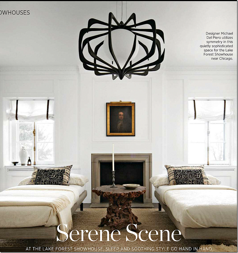
Honestly, what is going??? I wouldn’t even care if Picasso designed this. It looks like a breast with extra nipples. Gross, I know. But besides that – the proportion is off.
And these are top designers in these examples. Top. Some are even my favorite designers.
And another. I don’t understand. Magazine after magazine, the same thing – over and over again.
I like this house – a lot. But I just don’t understand this choice. I think the fixture over the dining room is so important – it should be timeless – not something that you will have to sell in a few years.
This room is a beauty. Until you look up at the ceiling. Am I just too old for this? The fixture looks out of focus for some reason. Maybe I AM too old – hand me my glasses!
Maybe not, because I like this. I get this. It’s original, from the 20s. It’s cool. OK. WHEW!!! I’m NOT too old!!!!
I just prefer this. I love this. It’s pretty. Is that so awful – to like pretty rooms?
And this….it’s classic.
And another room at Furlow Gatewood’s glorious estate.
World of Interiors had this English gem this month.
And this one. Antique tole chandelier. Could the wallpaper be any prettier?
How perfect is this? Christopher Spitzmiller. Another tole.
Jane Scott Hodges. Another perfection.
Corsica. This house is new. World of Interiors. It looks 200 years old. All I could think is thank God there wasn’t a Sputnik!
And then there was Traditional Home. I really like this showhouse room – but don’t look up!!!
And the dining room at the Traditional Home showhouse. OK, this one looks like blown bubbles It’s all the more awful when you see something beautiful:
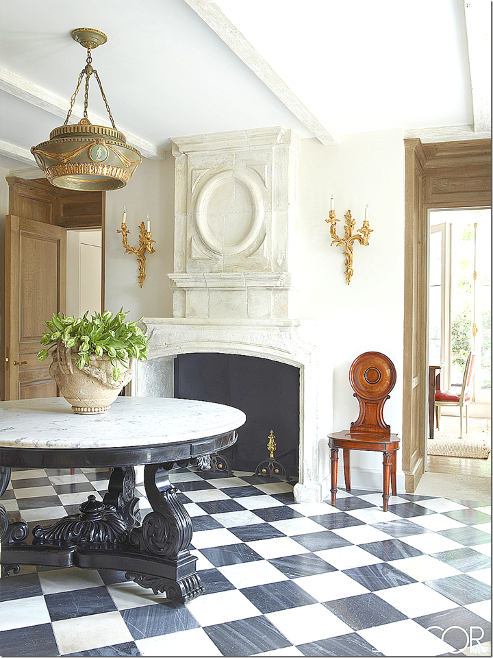
Like this. Emma Jane Pilkington. Stunning. The light fixture in the entrance hall is a beautiful antique. Notice the mantel. The hall chair. Did you notice all the round elements? The table. The mantel. The chair back. The lantern. It’s not an accident there are all these circular motifs.
Even the doors have the circular motif.
And this room. This is such a perfect space – a living room, a dining room, and a library – all in one. Matching crystal chandeliers – a classic choice which will keep this room looking great and current decades from now. It’s so beautiful. I love the antique Swedish chairs. And then – there is the second part of this story – the trend that I love – light wood floors.
No one loves dark hardwoods with white walls more than me. But lately, I’m loving the floors of limed oak or bleached oak or unfinished wood – whatever you want to call it – so much. The floors like these.
There. I said it. I’m over dark hardwoods.
In Emma Jane’s family room. More gorgeousness. I love the Chelsea Editions linen curtains.
And there is that limed oak again. Old planks on the floor that match the cabinetry. I’m obsessing over this wood. I finally admitted this to myself this weekend. It was traumatic though. These floors aren’t cheap. Or easy. It’s like saying out loud that you like Cashmere and not scratchy wool. Or you prefer a Range Rover and not a Ford pickup. It’s even scarier when you can only afford the pickup.
But reading so many magazines at one sitting, I finally realized – dark floors are done with. For now.
Done.
Sob.
Another photo of the bathroom where the beautiful light-stained floors continue.
Are dark hardwoods really over for the next decade? Are they finally out? This is painful to admit.
But, it’s hard to avoid the truth. This room just looks so fresh. And new. All light woods. There are no dark accents here – it’s all light woods and light fabrics. It is so perfect. Though it looks like might be easy to design – it’s not. I could write a book on all the correct choices that Ginger Barber made in her living room.
And in this room – again – light floors, light beams, light fabrics, and light stones. The difference here is the black iron is repeated throughout the décor – it gives it the right amount of pop. Again, perfection.
And here – I love how the Swedish antique chairs blend with the light French chairs and how the light wood table blends with the antique mirror.
All light – including the linen curtains. The rug is just the right tone.
But this is the story that really got me admitting the love affair with dark hardwoods was over.
In the summer issue of Milieu – this Californian house renovated by Tim Clarke is done in all limed woods – including the front door.
The entry shows the decor right away. I love the way the sight line from the front door goes right out through the window to the beach.
The living room introduces touches of dusky blues that bring the ocean view inside. The stain on the wood represents the driftwood from the beach. The colors in this house completely blend in with the views found outside.
I think I stared at this picture for 30 minutes. I love the way the table’s stain blends in with the floors and the beams. The blues continue in this room.
The kitchen has a backsplash that looks like the beach shells in the tide. It is gorgeous!
The bedroom continues the décor of blues and creams and driftwood.
It was this house that sealed it. Suddenly dark woods looked a bit dated. Not to worry, they’ll be back again soon. But still…
What if you don’t have wood – here the light stone creates the same look, while the doors and beams are limed in this house.
This house in Milieu is all light woods with accents of dark brown.
Another beach house – with the colors of the sea – blues and sand.
These floors look whitewashed here. Even though all the woods are light – you can still do a bright punch of color like the pinks.
Do you have dark hardwoods – large expanses of inexpensive seagrass changes it completely. Instead of dark – there are big areas of light.
Another choice to get the light look for not a huge amount of expense – wall to wall seagrass.
And so – two major trends have taken over our houses. Crazy, artistic light fixtures and beautifully limed, light woods.
Agree – yes or no?
Thursday, July 16, 2015
Two Trends: One Good, One Horrid
Subscribe to:
Post Comments (Atom)


![image_thumb11[1] image_thumb11[1]](http://lh3.googleusercontent.com/-lA34qSY8BTw/VahgaLwndiI/AAAAAAAC8iw/xr8nLDS24y8/image_thumb111_thumb%25255B2%25255D.png?imgmax=800)

![image_thumb14[1] image_thumb14[1]](http://lh3.googleusercontent.com/-fMwmGUTQLqg/VahglJEWlHI/AAAAAAAC8jg/NryhobZK45A/image_thumb141_thumb.png?imgmax=800)


![image_thumb24[1] image_thumb24[1]](http://lh3.googleusercontent.com/-geiXYYFob6M/VahjynfG1FI/AAAAAAAC84I/ZuSyIk2CIoo/image_thumb241_thumb%25255B1%25255D.png?imgmax=800)


0 comments:
Post a Comment