Back in 2008 I wrote a story about a Houston townhouse that was for sale. I loved the townhouse – and thought the design was exactly what I would do in the same space, if I were the decorator. I called it “Lessons From A Townhouse” and went over each detail that the owner had gotten right. (The original story is HERE but for some reason the pictures have disappeared!)
Recently I noticed that the townhouse had sold yet again and thought it would be fun to see what the new owners had done with the space and if the townhouse that I so loved in 2008 still looked as good in 2015.
Enjoy!!!!
The townhouse is a three story Piano Nobile – it’s main floor is on the second level. Guest bedrooms are on the first floor, while the master is on the top floor with a large terrace. White stucco, the townhouse is located in the trendy - inside the loop area – in an older neighborhood where houses are torn down for larger multifamily complexes.
The same view at night. Most of this neighborhood is filled with empty nesters or newly marrieds without children. The front of the townhouse is quite attractive – sited on the street – it is located behind an iron gate.
It’s a multi family complex – and here is a view of the back where the garage is.
The double front French door is reached through a pergola.
AFTER: This view of the entry wasn’t shown in 2008. You can see immediately that new owners are like the former owners – they like casual antiques and textiles.
AFTER: And another view of the entry – shows the interesting floor – limestone with mosaic tiles. Seagrass runner leads to the main level.
AFTER: the view upstairs – with the seagrass runner and the sconces – both of which I love. There were no views of the stairs from the previous owners.
BEFORE: The living room – as seen with the former owner’s furniture. Back then, I absolutely loved their décor. I loved that there was a lot of high and low furniture – creating interest in the room. I also loved that instead of a coffee table, they added a dining table which would provide extra space for dinner parties. Hmmm. Not so sure I still love that today! I did note that the drapes were not on each window – something that I felt should have been done. I still agree on that.
BEFORE: Another view of the living room showing the two sided fireplace and views into the dining room. Love the chandelier.
AFTER: It looks like the previous owners left the silk curtains and the chandelier – what a surprise. I still think there should have been curtains throughout. Did they leave the baby grand piano too? There is a new rug – which is a much better size and two antique chaises. Hmmm. I can’t decide if I like this better or not. I do like the sparseness of it.
AFTER: The view from the other side – this owner added two bookcases where there was a sofa before. They do fit the space well. Are those from Tara Shaw? Maybe discontinued from there?
AFTER: another view. The room looks very nice from this view. BUT – the previous owners hung the chandelier over the dining room table originally – and here, it seems off center. It should be in the center of the room. Actually, the room is off balanced a bit because of the placement of the fireplace.
BEFORE: At the other side of the fireplace is the dining room. Love the chandelier and skirted table with antique chairs. I thought this was simple but very elegant. I still do.
AFTER: Beautiful French chairs. And I love the antique mirror and chest in the alcove. And this chandelier is absolutely gorgeous. Just gorgeous. The new owners added a cowskin rug – making the space a bit trendy. I must say I prefer this dining room to the previous owners.
AFTER: Another view – well, the curtains all pushed to one side looks a little sloppy. They look better before – divided. If this was me – I would hang them higher, closer to the ceiling – then I would add fabric shades between the window and the top of the curtains to hide the “dead space.” Also – I always, always line my curtains with blackout to avoid the light shining through. I do think a creamy silk would have been better than the gold – the gold went with the previous décor – not so much this.
BEFORE: The kitchen before – a bit early 2000 Frenchifried.
BEFORE: Another view.
AFTER: Looks better without the country French barstools, for sure which were way too short.
AFTER: Another view – I would probably update the granite with marble or white countertops.
BEFORE: I loved this room. I went on and on about the custom cut seagrass – at the time something few people did. I loved the antique styled sofa and chairs. I loved the mirror’s placement and the prints – noting they were hung correctly, just a few inches above the sofa.
Before: another view – love the shutters at the French doors.
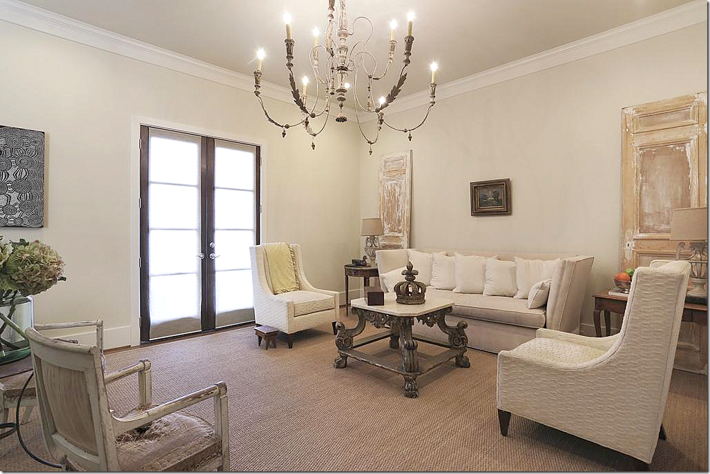
AFTER: OK – are those the same shutters? And I love that they took down the ceiling fan and put up a chandelier instead. Not sure if that was the one in the dining room. Love the mirror and the Tara Shaw coffee table. But I miss the prints and the antique styled sofa and chairs. I think the mirror would look better over the sofa.
AFTER: Love the antique chairs and the metal table. I do think the shutters looked better at the French doors.
AFTER: OK – this owner added doors where the TV was. Love that detail. But I’m being picky. They didn’t have the seagrass recut under the doors. NOTE: having your seagrass recut is NO BIG DEAL. They can do it on site. And – the beauty of seagrass? It’s just not that expensive to replace which is why I love it. Really beautiful antique chairs.
BEFORE: I loved the powder room with all its antique books and baskets. Just so casual.
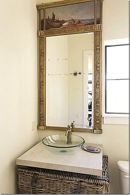
AFTER: Much prettier mirror. Interesting that they left the basket?
AFTER: Views of the hall showing the double doors to the master bedroom.
AFTER: The view into the bedroom with the pretty double doors.
BEFORE: The master bedroom. I loved this. I loved the high bed and noted it was probably placed on risers purchased at Bed Bath and Beyond. I loved the arch and the antique shutters that added texture. I loved the lantern. And I loved all the furniture in front of the bed. I loved the wall to wall seagrass. I still love this room all these years later.
BEFORE: Another view showing the antique armoire and the study beyond.
BEFORE: A fauxed breakfast bar in the alcove next to the master bed.
A beautiful French antique day bed in the study in the master bedroom. I said this room needed curtains and shades – and I still agree. I loved the wicker basket instead of a coffee table.
BEFORE: The master bedroom terrace with antique furniture and a large urn.
BEFORE: The master bathroom. I loved the bench and furniture. But looking at this now – can’t say I like the manly duck print in the bath alcove!
AFTER: I like this – love the headboard and the mirrors. Love that they kept the shutters. Love the new lantern and the French chairs – but I probably prefer the before décor more. Still this is very pretty.
AFTER: Love this armoire. OK, Love this more than the armoire before.
AFTER: Fabulous Swedish sofa from Tara Shaw that I love, love, love! And I love the gray shutters they added.
AFTER: Same furniture? OK – I have no idea why the previous owners left so much furniture??? The added curtains are a nice touch.
AFTER: less furniture is better. Tara Shaw cachepot.
BEFORE: The Guest Room – I loved this with the beautiful armoire and the lantern and wine table.
AFTER: Swedish chest. Seagrass is gone, which I miss. Tara Shaw floor lamp. I think that might be a Tara Shaw cornice that was discontinued. BTW – I love Tara Shaw Maison furniture – I think her reproductions are wonderful. OK – prefer the 2008 version.
OK – so, do you prefer the 2008 version?
Or the 2015 version. I’m divided. Some parts of each – I wish I could pick and choose from each version!!
It is interesting to see how two talented people designed the same space. Do people usually sell a house and let the new owner keep some of the furniture? That was strange – but nice for the new owners!
NOTICE: Information on HUGE contest coming up next!!!!!!!!!


0 comments:
Post a Comment